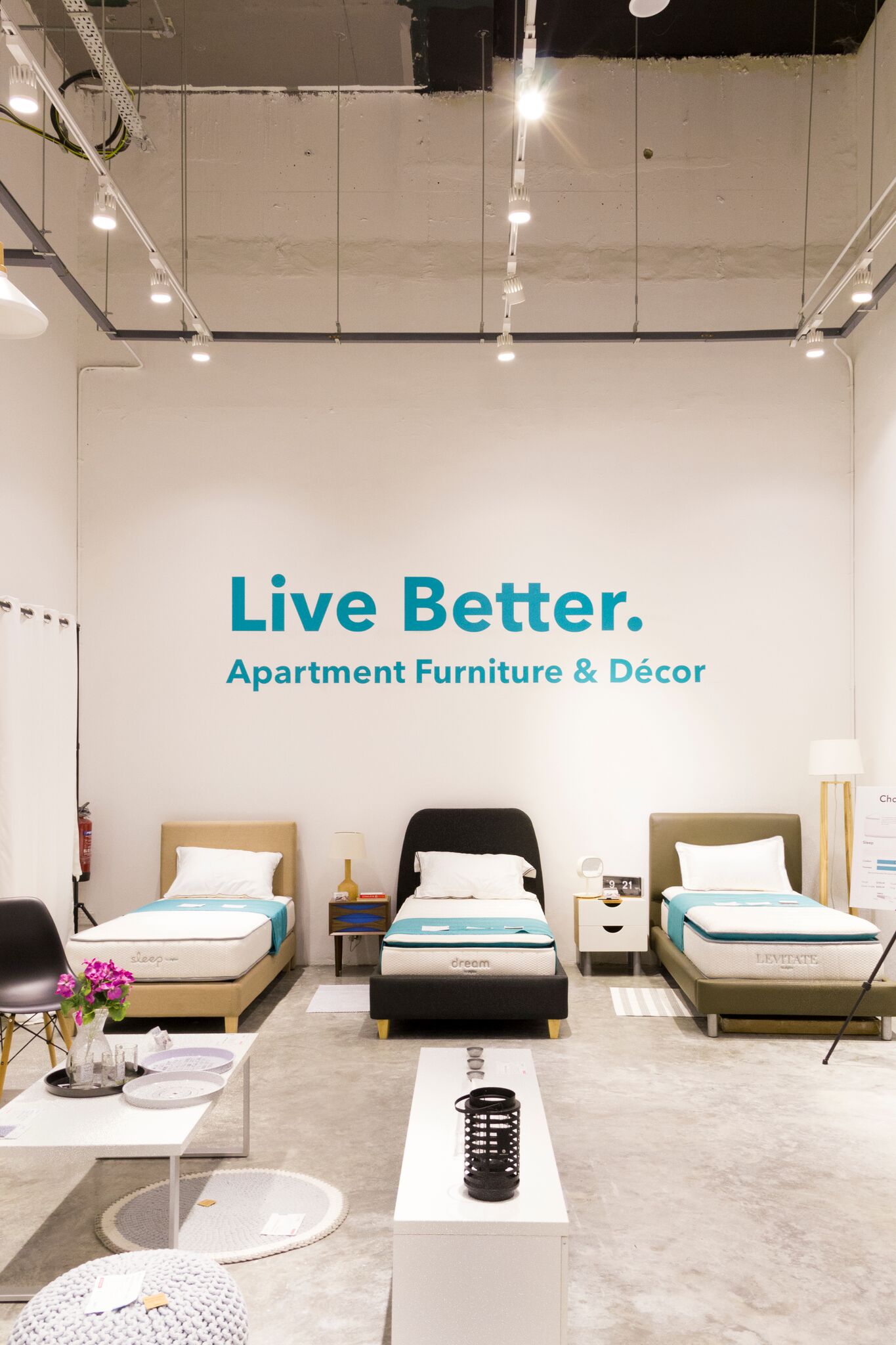
Suntec City Pop-up
Following the success of the first pop-up store, HipVan was ready to open their doors for the second time (2016). Wiser from our first experience, this pop-up store was to be bigger, better and more holistic. Diving deeper into space planning, I was tasked again to lead and design the user experience of when a customer would step into the store. What would they see, what would they want to see, what story would we tell, what user journey, what is the best way to communicate quality, design, and a home...were just some of the questions that led the interior design for this pop-up.
Having to question what we are and represent as a company, the goal was to close the gap between the digital world and the physical world to assure customers that we were in the business to build homes and not houses.
Each corner was carefully curated to tell a story, present a style and inspire customers. The walkway was designed such that even parents with kids in a stroller could freely move around and enjoy their shopping experience without any inconveniences. The ease with which a customer could gather data and navigate through the store was representative of the ease with which customers could shop online at HipVan.


